Styling Genie apps
Cascading Style Sheets (CSS) is a language for styling HTML documents, enabling developers to separate design from content. CSS enhances websites with visually appealing layouts, improved loading times, responsive design, and cross-browser compatibility.
In a Genie app you can use inline CSS style attributes or define your own stylesheets in the public/ folder and import them with
Stipple.Layout.add_css("froop.css", "bootstrap.css")
If you write your styles in public/css/genieapp.css, these will be automatically imported into your app's page. Moreover, you can also use the predefined classes provided by the Quasar framework.
Here's an example of a page using several CSS styles and classes:
 [h1(class="blue-text", "Heading"),
 p(style="color: green; background: cyan", "Inline styled paragraph."),
 p(class="red-text","Paragraph with class.")]
The classes are defined in the public/css/genieapp.css file, where specific elements are targeted with selectors:
/* Class Selector */
.red-text {
  color: red;
}

/* Element Selector */
p {
  font-size: 14px;
}

/* Class Selector */
.blue-text {
  color: blue;
}
Using Quasar classes
The Quasar components come with their own pre-defined CSS classes. These classes are added to the HTML elements to style the layout, paddings, and more. For example, the q-pa-sm class adds small padding to an element, while the col-12 class sets the width of a column in a 12-column grid layout:
cell(class="q-pa-sm col-12",
    p("This paragraph has small padding and takes the full width of the container."))
Check the official Quasar documentation for a comprehensive list of available classes: Quasar CSS Helpers.
Using Stipple Classes
Stipple extends Quasar's Layout classes, offering utility classes that simplify organizing app content. Instead of individually assigning styles to elements (which could produce hard-to-mantain results), we encourage you to use these classes so that space distribution and spacing is consistent across your whole app. At your disposal you have classes for defining layouts (rows and columns), spacing (padding, margin, gap) and more.
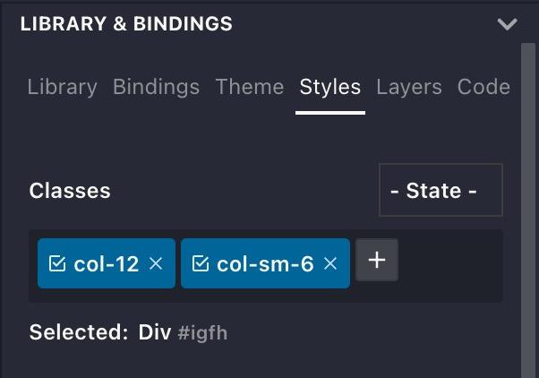
This document only shows classes applied in HTML. In order to do this in Genie Builder all you need to do is to select the element, open the Styles pane and apply the same classes, as in this screenshot below:
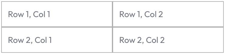
Layout
Organize your content layout with the Flex Grid system using rows and columns. Rows arrange content horizontally while columns do so vertically. This allows you to easily align and distribute elements in fixed and dynamic space. Rows and columns act as containers for child elements. Note: Screenshots below include borders and spacing for clarity.
<div class="row">
    <div class="col">Row 1, Col 1</div>
    <div class="col">Row 1, Col 2</div>
</div>
<div class="row">
    <div class="col">Row 2, Col 1</div>
    <div class="col">Row 2, Col 2</div>
</div>
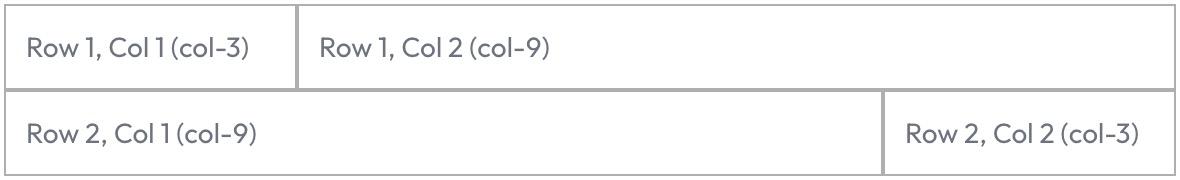
Space Distribution
Control horizontal space distribution in columns using col-* classes (* ranges from 1 to 12). The total of 12 allows for intuitive divisions (e.g., 2, 3, 4, or 6 equal parts).
Example: For two columns of equal width, use col-6. For columns occupying 25% and 75% of the width, use col-3 and col-9 respectively:
<div class="row">
    <div class="col-3">Row 1, Col 1 (col-3)</div>
    <div class="col-9">Row 1, Col 2 (col-9)</div>
</div>
<div class="row">
    <div class="col-9">Row 2, Col 1 (col-9)</div>
    <div class="col-3">Row 2, Col 2 (col-3)</div>
</div>
Responsive Design
Create adaptive layouts using size-specific classes applied per screen size. For instance, display columns with 25% and 75% widths on larger screens, switching to 100% width (stacked vertically) on smaller screens:
<div class="row">
    <div class="col-12 col-sm-3">col-12, col-sm-3</div>
    <div class="col-12 col-sm-9">col-12, col-sm-9</div>
</div>
Large Screen
Smaller Screen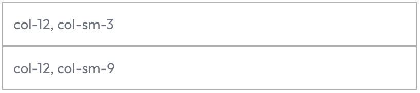
Spacing
Rows and columns, by default, do not display padding or margins, so that inner content is aligned exactly at their boundaries. Margin and padding can be easily added using Quasar's spacing classes. Let's see some examples.
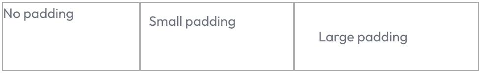
Padding
Adding empty space inside elements is usually recommended for easier reading, specially when wrapping content inside elements with borders or background colors. Using the right padding will often produce a more comfortable experience and professional appearance. Here's an example using the padding utility classes:
<div class="row">
    <div class="col">
        <div>No padding</div>
    </div>
    <div class="col q-pa-sm">
        <div>Small padding</div>
    </div>
    <div class="col q-pa-lg">
        <div>Large padding</div>
    </div>
</div>
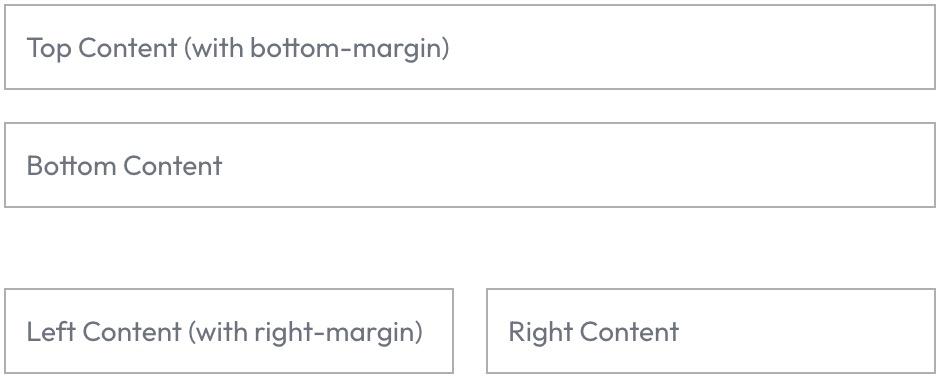
Margin
Padding is usually the most convenient way of spacing content, as it is applied inside the selected element without affecting the box-sizing dimensions. However, margins can also be applied if necessary by using the appropriate classes. Margins create outer spacing between elements. Example:
<div class="col">
    <div class="q-mb-md">Top Content (with bottom-margin)</div>
    <div>Bottom Content</div>
</div>
<div class="row">
    <div class="col q-mr-md">Left Content (with right-margin)</div>
    <div class="col">Right Content</div>
</div>
Gap
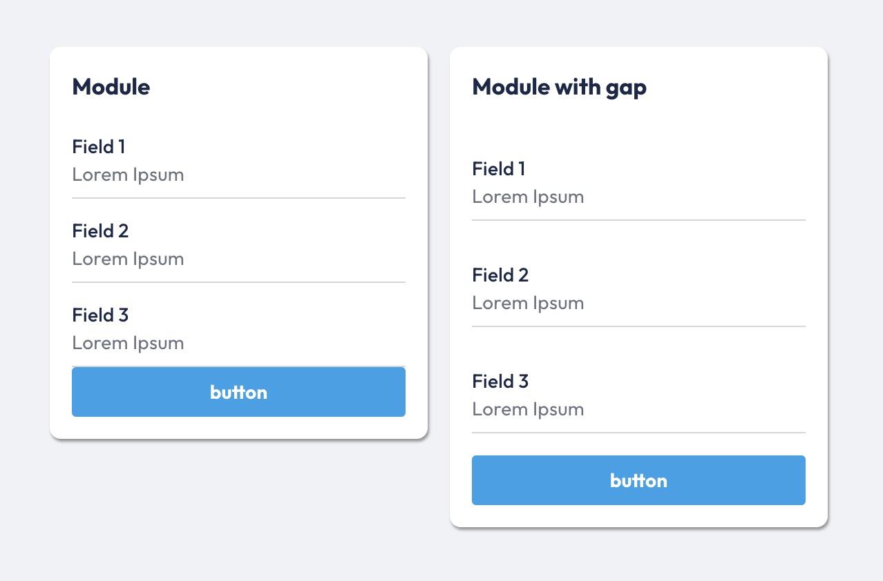
Elements can be spaced from each other by applyng margin or padding individually to each element. This enables fine-grain customizations if needed, but in general it's more common to be wanting to add spacing between all elements of a group. You can assign the st-gap-* classes to the container, which will automatically space its children as needed.
st-gap-{xs|sm|md|lg|xl}
In the example below, the left column has no gap (default). The right column has been assigned the st-gap-md class, producing a more readable UI so that each input (and its label) is presented appart from the rest.
<div class="row">
    <div class="col-6">
        <div class="st-module">
            <p class="st-module-title">Module</p>
            <q-input v-model="msg" label="Field 1"></q-input>
            <q-input v-model="msg" label="Field 2"></q-input>
            <q-input v-model="msg" label="Field 3"></q-input>
            <q-btn color="primary" label="button"></q-btn>
        </div>
    </div>
    <div class="col-6">
        <div class="st-module st-gap-lg">
            <p class="st-module-title">Module with gap</p>
            <q-input v-model="msg" label="Field 1"></q-input>
            <q-input v-model="msg" label="Field 2"></q-input>
            <q-input v-model="msg" label="Field 3"></q-input>
            <q-btn color="primary" label="button"></q-btn>
        </div>
    </div>
</div>
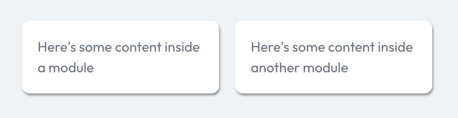
Stipple Module
Group content visually with the st-module class. It adds background color, shadow, padding, and margins for a clean, professional presentation. Use st-module on child elements (not rows/columns) to maintain layout integrity.
<div class="row">
    <div class="col">
        <div class="st-module">
            Here's some content inside a module
        </div>
    </div>
    <div class="col">
        <div class="st-module">
            Here's some content inside another module
        </div>
    </div>
</div>
Conclusion
By using Stipple's utility classes and layout structure, you ensure a cohesive design system with consistent spacing and layout behavior. This simplifies maintenance and improves the overall user experience in your apps.
Using Tailwind CSS
Tailwind CSS is a popular framework providing a set of utility classes to style a page. With it you can customize almost every aspect of your app's design without having to define your own stylesheets. See this page for a list of available classes. To use Tailwind, include the necessary JavaScript with
Stipple.Layout.add_script("https://cdn.tailwindcss.com")
Here's the previous example using Tailwind classes:
cell(class="p-4 w-full bg-blue-100 border border-blue-200 rounded shadow",
    p(class="text-blue-800 font-semibold", "This paragraph has moderate padding, a blue background, a rounded border, and a shadow, taking the full width of the container."))
This paragraph has moderate padding, a blue background, a rounded border, and a shadow, taking the full width of the container.